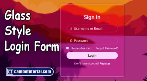
Login Form Design Glassmorphism Style CSS and HTML
3 minutes read
Hello friends, this article we will help you to design login form using glassmorphism style in CSS and HTML. We will create simple user login form template using HTML and CSS in web application, sometimes is difficulty for beginner and today I will help you to design login layout using glass style which is you can see through the background.
Glassmorphism is a design trend in user interfaces that aims to create a frosted glass-like appearance, often utilizing transparency, blur, and background effects to mimic the look of frosted glass. This effect can be implemented using HTML and CSS to create a modern and visually appealing user interface. Here's a simple explanation of how to achieve Glassmorphism using HTML and CSS:
Create file index.html
<!DOCTYPE html>
<html lang="en">

<head>
    <meta charset="UTF-8">
    <meta name="viewport" content="width=device-width, initial-scale=1.0">
    <title>Document</title>
    <link rel="stylesheet"
        href="https://fonts.googleapis.com/css2?family=Material+Symbols+Outlined:opsz,wght,FILL,GRAD@20..48,100..700,0..1,-50..200" />
    <link rel="stylesheet" href="style.css">
</head>

<body>
    <div class="container">
        <form action="">
            <h1>Sign In</h1>
            <div class="wrap-input">
                <input type="email" placeholder="Username or Email">
                <span class="material-symbols-outlined">
                    person
                </span>
            </div>
            <div class="wrap-input">
                <input type="password" placeholder="Password">
                <span class="material-symbols-outlined">
                    lock
                </span>
            </div>
            <div class="remember-forgot">
                <label for="remember-forgot">
                    <input type="checkbox" name="remember-forgot" id="remember-forgot">
                    Remember me
                </label>
                <a href="#">Forgot Password?</a>
            </div>
            <button type="submit" class="btn">Login</button>
            <div class="register-link">
                <p>Don't have account? <a href="#">Register</a></p>
            </div>
        </form>
    </div>
</body>
</html>
Create file style.css
@import url('https://fonts.googleapis.com/css2?family=Ubuntu:ital@0;1&display=swap');

* {
    margin: 0;
    padding: 0;
    box-sizing: border-box;
    border: none;
    outline: none;
    font-family: 'Ubuntu';
}

body {
    display: flex;
    justify-content: center;
    align-items: center;
    min-height: 100vh;
    background: url('https://img.freepik.com/free-vector/flat-adventure-background_23-2149054484.jpg?w=1480&t=st=1705754370~exp=1705754970~hmac=8d76349226d2eaf928c0232100ffcfb93bb1cb72772c80460d2abd0144fb6b23');
    background-size: cover;
    background-position: center;
}

.container {
    width: 420px;
    backdrop-filter: saturate(125%) blur(5px);
    border: 2px solid rgba(255, 255, 255, .4);
    box-shadow: 0 0 10px rgb(0, 0, 0, 0.3);
    color: white;
    border-radius: 10px;
    padding: 60px 40px;
}

.container h1 {
    font-size: 36px;
    text-align: center;
}

.wrap-input {
    position: relative;
    width: 100%;
    height: 50px;
    margin: 30px 0;
}

.wrap-input span {
    position: absolute;
    left: 20px;
    top: 50%;
    transform: translateY(-50%);
    font-size: 20px;
}

.wrap-input input {
    width: 100%;
    height: 100%;
    background: transparent;
    border: 3px solid rgba(208, 207, 207, 0.2);
    border-radius: 40px;
    font-size: 22px;
    color: white;
    padding: 20px 20px 20px 45px;
}

.wrap-input input::placeholder {
    color: rgb(252, 252, 252);
}

.container .remember-forgot {
    display: flex;
    justify-content: space-between;
    font-size: 18px;
    margin: -15px 0 15px;
}

.remember-forgot label input {
    accent-color: white;
    margin-right: 15px;
    transform: scale(1.5);
}

.remember-forgot a {
    color: white;
    text-decoration: none;
}

.remember-forgot a:hover {
    text-decoration: underline;
}

.container .btn {
    width: 100%;
    height: 45px;
    background-color: white;
    border-radius: 40px;
    box-shadow: 0 0 10px rgb(0, 0, 0, 0.1);
    cursor: pointer;
    font-size: 22px;
    font-weight: 600;
}

.container .btn:active {
    background-color: #ebebeb;
}

.container .register-link {
    font-size: 18px;
    text-align: center;
    margin: 20px 0 15px;
}

.register-link p a {
    color: white;
    text-decoration: none;
    font-weight: 600;
}

.register-link a:hover {
    text-decoration: underline;
}
Explanation of the key CSS properties in class name .container
background: Sets a semi-transparent white background to simulate frosted glass.backdrop-filter: Applies a blur effect to the background.border-radius: Rounds the corners of the container.box-shadow: Adds a subtle shadow to enhance the 3D effect.
You might also like
CSS
Author
As the founder and passionate educator behind this platform, I’m dedicated to sharing practical knowledge in programming to help you grow. Whether you’re a beginner exploring Machine Learning, PHP, Laravel, Python, Java, or Android Development, you’ll find tutorials here that are simple, accessible, and easy to understand. My mission is to make learning enjoyable and effective for everyone. Dive in, start learning, and don’t forget to follow along for more tips and insights!. Follow him