Form Login Glow Border Effect Rotation Style CSS HTML Only
3 minutes read
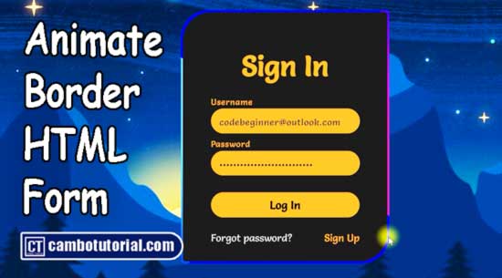
Today we will have new design login form using only HTML and CSS to make any animated glow effect border using keyframe and CSS3 properties. We need to have creative idea to generate very beautiful form login to grab user attention. The below example we will have example and completed code to help you understand and create very beautiful form.
You can create this by imagine in 3D that they have layer in sit on each other, we will make rotation animate layer than cover with another layer but just reduce size so the layer in behind will appear as a little line.
Create file index.html
<!DOCTYPE html>
<html lang="en">

<head>
    <meta charset="UTF-8">
    <meta name="viewport" content="width=device-width, initial-scale=1.0">
    <title>Document</title>
    <link rel="stylesheet" href="style.css">
</head>

<body>
    <div class="box">
        <form action="">
            <h2>Sign In</h2>
            <div class="input-box">
                <input type="text" name="" id="" required>
                <span>Username</span>
                <i></i>
            </div>
            <div class="input-box">
                <input type="password" name="" id="" required>
                <span>Password</span>
                <i></i>
            </div>
            <button type="button">Log in</button>
            <div class="links">
                <a href="">Forgot Password?</a>
                <a href="">Sign Up</a>
            </div>
        </form>
    </div>
</body>

</html>
Create file style.css
@import url('https://fonts.googleapis.com/css2?family=Salsa&display=swap');

* {
    margin: 0px;
    padding: 0px;
    outline: none;
    border: none;
    box-sizing: border-box;
    font-family: 'Salsa';
}

body {
    display: flex;
    justify-content: center;
    align-items: center;
    background: url(https://img.freepik.com/free-vector/gradient-winter-solstice-illustration_23-2149180132.jpg?w=1800&t=st=1705549624~exp=1705550224~hmac=e04e0a60ded55925db59a18d2d3d9f832535bb335c06de34c73bbd2ffbef2f2a);
    background-size: cover;
    min-height: 100vh;
}

.box {
    position: relative;
    width: 370px;
    height: 450px;
    background: #481eff;
    border-radius: 50px 5px;
    overflow: hidden;
}

.box::before {
    content: '';
    position: absolute;
    top: -50%;
    left: -50%;
    width: 370px;
    height: 450px;
    background: linear-gradient(60deg, transparent, #44caff, #44caff);
    transform-origin: bottom right;
    animation: animate 6s linear infinite;
}

.box::after {
    content: '';
    position: absolute;
    top: -50%;
    left: -50%;
    width: 370px;
    height: 450px;
    background: linear-gradient(60deg, transparent, #d9138a, #d9138a);
    transform-origin: bottom right;
    animation: animate 6s linear infinite;
    animation-delay: -3s;
}

@keyframes animate {
    0% {
        transform: rotate(0deg);
    }

    100% {
        transform: rotate(360deg);
    }
}

form {
    background: #1c1c1c;
    inset: 2px;
    position: absolute;
    z-index: 2;
    border-radius: 50px 5px;
    padding: 50px;
    display: flex;
    flex-direction: column;
}

h2 {
    color: #FB8B24;
    font-size: 50px;
    text-align: center;
}

.input-box {
    position: relative;
    width: 265px;
    margin-top: 35px;
}

.input-box input {
    position: relative;
    width: 100%;
    padding: 20px 10px 10px;
    background-color: transparent;
    color: #23242a;
    font-size: 1em;
    letter-spacing: 0.05em;
    z-index: 1;
}


.input-box span {
    position: absolute;
    left: 0;
    padding: 20px 10px 10px;
    font-size: 18px;
    color: #8f8f8f;
    pointer-events: none;
    letter-spacing: 0.05em;
    transition: 0.5s;
}

.input-box input:valid~span,
.input-box input:focus~span {
    color: #FB8B24;
    transform: translateX(-10px) translateY(-35px);
    font-size: 15px;
}

.input-box i {
    position: absolute;
    left: 0;
    bottom: 0;
    width: 100%;
    height: 2px;
    background: #FB8B24;
    transition: 0.5s;
    pointer-events: none;
}

.input-box input:valid~i,
.input-box input:focus~i {

    height: 44px;
    border-radius: 25px;
}

button {
    font-size: 20px;
    background: #FB8B24;
    padding: 10px;
    margin-top: 40px;
    border-radius: 25px;
    font-weight: 600;
    cursor: pointer;
}

button:active {
    opacity: 0.8;
}

.links {
    display: flex;
    justify-content: space-between;
}

.links a {
    margin: 25px 0;
    font-size: 1em;
    color: #8f8f8f;
    text-decoration: none;
}

.links a:hover,
.links a:nth-child(2) {
    color: #FB8B24;
}
You might also like
CSS
Author
As the founder and passionate educator behind this platform, I’m dedicated to sharing practical knowledge in programming to help you grow. Whether you’re a beginner exploring Machine Learning, PHP, Laravel, Python, Java, or Android Development, you’ll find tutorials here that are simple, accessible, and easy to understand. My mission is to make learning enjoyable and effective for everyone. Dive in, start learning, and don’t forget to follow along for more tips and insights!. Follow him